How green colors are shaping food perception: Insights from Prof. Spence
In conversation with Professor Charles Spence
Food’s visual appearance is one of our most important sensory cues in setting taste and flavor expectations, with color saturation and opacity playing a vital diagnostic role. Color cues predict whether something looks sweet, sour, or satisfying, and, more often than not, our tasting experience matches up. As the color green – with its planet-positive but potentially bitter-tasting connotations – infiltrates untraditional food and drink categories, how are green colors shaping food perception? We spoke to Professor Charles Spence, head of the Crossmodal Research Laboratory at the University of Oxford, about what the rise of green means for the future of food coloring.
In collaboration with Professor Charles Spence, head of the Crossmodal Research Laboratory at the University of Oxford, we explore the psychology behind the color green and its impact on food and drinks.
What is the psychological impact of green in our diets, and how does this differ demographically?
There’s an interesting dichotomy here, because if you ask what most people’s favorite colors are the world over, they are blue and green – the colors of nature and water. But if you were to change that question slightly to ask people what their favorite food colors are, blue and green would probably drop to the bottom of the list. In part, that’s because people associate green with plants, and the tastes we associate with plants are often bitter, not very energy dense, but – as we’re now learning – very good for us. Literature suggests we like the look of foods that are energy dense and satisfying, and that’s not the first thing that springs to mind with green food.
For children, green is generally something to be avoided because of the bitter taste of vegetables such as broccoli, brussels sprouts, kale, and cabbage. And there’s an argument to say this makes sense because bitter foods might be poisonous. As we get into adulthood, there is more concern around health and climate issues, making green more appealing. For the elderly, they’re from the WWII generation, so they regress to greens being something they were forced to eat and therefore ‘bad’ again.
How do different saturations and shades of green within food and drink change our taste, texture and aroma expectations?
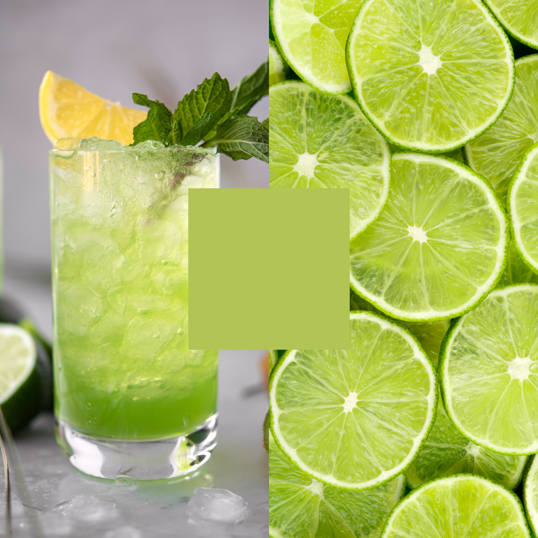
We’re generally drawn to brighter, saturated hues as we associate them with more intense tastes or flavors. There’s also a textural distinction – if something is transparent green we think of lime juice or cordial, but if it’s opaque or textured, it becomes a vegetable. Food can be the same shade, but the texture changes its meaning. And if there’s more whiteness to green, as with matcha tea, that takes it away from bitter, plant-based associations. There’s an analogy here with reds, which are associated with sweetness. Fresh fruit ranges from green and sour to red, ripe and energy dense, yet in processed foods, the sweetest color of all is pink – or red with a bit of whiteness. To avoid the bitter connotations of green, dialing down the saturation to make it whiter, but still natural-looking, might help people like it more.
What is the psychology behind bringing brighter, more saturated colors into food products?
Across all food and drink categories, color trends are driven by social media. It’s been suggested that the resurgence of rosé wine and the Aperol spritz is more about how those drinks look than their taste or constitution. And with blue – a formerly disliked color for food – while it’s now all over Instagram, it’s difficult to find a chef who uses blue because there’s no flavor value, it only plays a visual role.
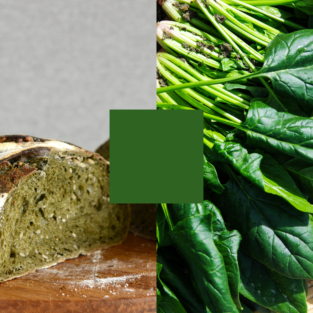
This offers an opportunity to use unusual greens in untraditional categories, such as bakery. As well as standing out – like Gatorade blue against all the other fruit-colored drinks – a product’s image provides signals. If a food is green, it’s not about sweetness so it’s probably good for you, the planet, or both, whether or not it tastes good.
How can brands play with unexpected color and taste combinations in non-traditional product categories?
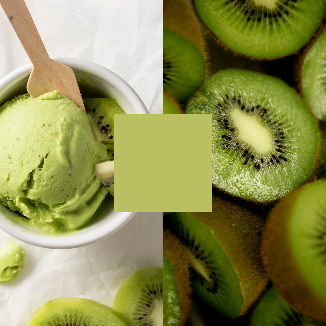
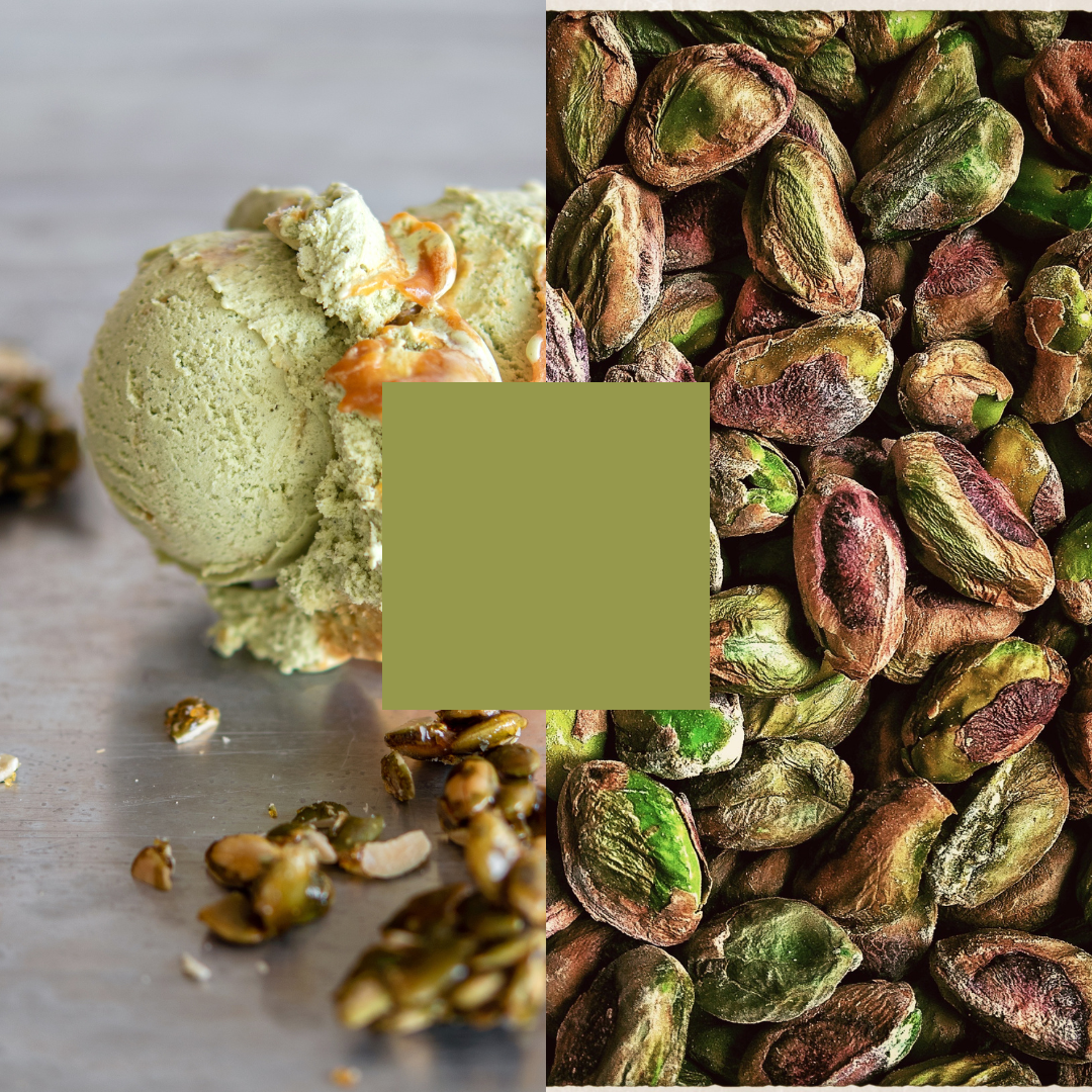
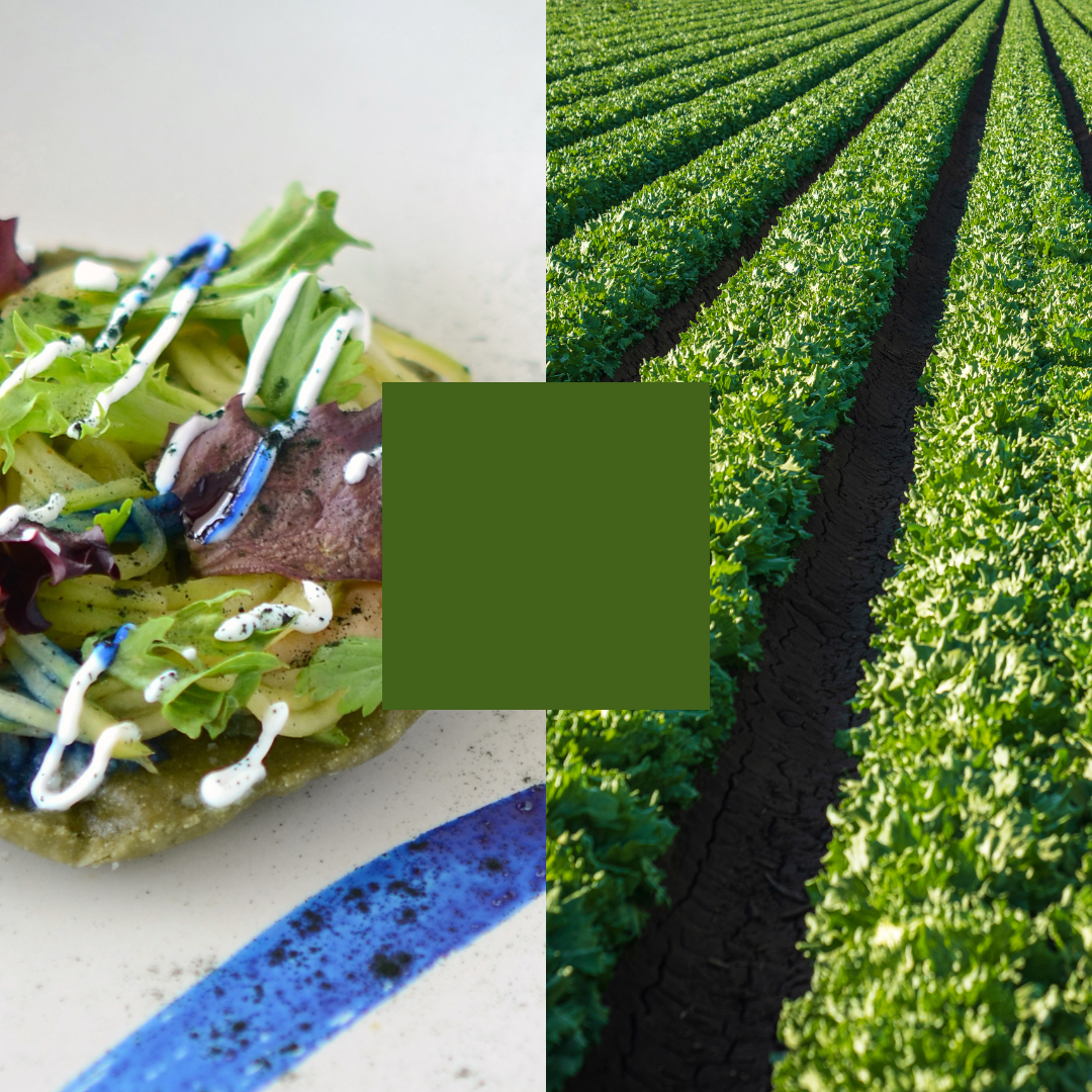
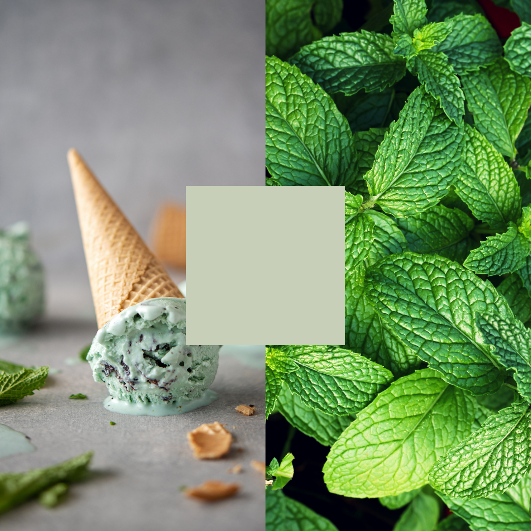
I remember having milky white-green ice cream in Japan 20 years ago and assuming it would be pistachio or mint, but it turned out to be green tea – it’s this combination of expectation and surprise you never get over. Therefore, it’s hard to imagine another flavor entering this space. Green has already been taken in ice cream for what it signifies, so it would need to be a vivid shade to distinguish it from familiar associations. Whereas within bakery, people are less likely to have seen that color, so it’s open for anyone to come in and own what green means. The growing popularity, revival, or introduction of green depends on the product category – so while in drinks and pasta some shades are already taken, in other categories it doesn’t yet exist. There are also abstract associations with green, so those plant-based, bitter, and healthy connotations might be different elsewhere.
How can brands disrupt green color expectations successfully?
Playing with people’s expectations of color, taste, and flavor is risky, but works in modernist, molecular restaurants. If a food’s color and taste is unexpected, people think it must be designed that way if they’re dining in a fancy place, but when mainstream brands try it or people serve it up at home, are their guests more likely to think they just can’t cook? Equally, the surprise element might only work once, so is more likely to fail – the possible exception being kids’ food, where you have different colored ketchups or Confused Skittles.
Another concept to consider is dynamic color-changing dyes, such as butterfly-pea-flower blue that changes to paean red or violet with lemon juice. Yumchaa’s Black Voodoo Magic Tea was very successful a few years ago, turning from turquoise to purple, while gin companies have used a bold color to stand out on the shelf but adding tonic changes the hue and avoids negative connotations. It would be interesting to see what is technically possible with natural green coloring. While for many people, a green iced donut just doesn’t seem right, it is virtue signaling to others who see it that you are ‘green’, or taking a planet-first path, and this color is helping you get you there.
Are there any new green ingredients on the horizon?
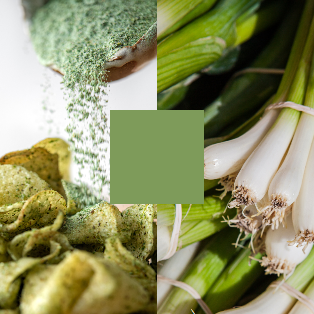
There are many herbs and leafy greens waiting to be rediscovered. Lovage has been forgotten in contemporary cuisine, but was huge centuries ago. They call it the Maggi (a soup-seasoning brand) plant in Germany because it adds an umami, almost salty profile and has beneficial health properties. Also guasca, or potato weed, is used in Colombian cuisine – it tastes of artichoke and grows everywhere.
Around the world, these medicinal plants offer a huge opportunity, tapping into ancient practices such as Chinese traditional medicine. Often called weeds, they are mostly green and are potentially the perfect future food. By definition, you can’t get rid of weeds – they grow by themselves – and many are very tasty and rich in phytonutrients.
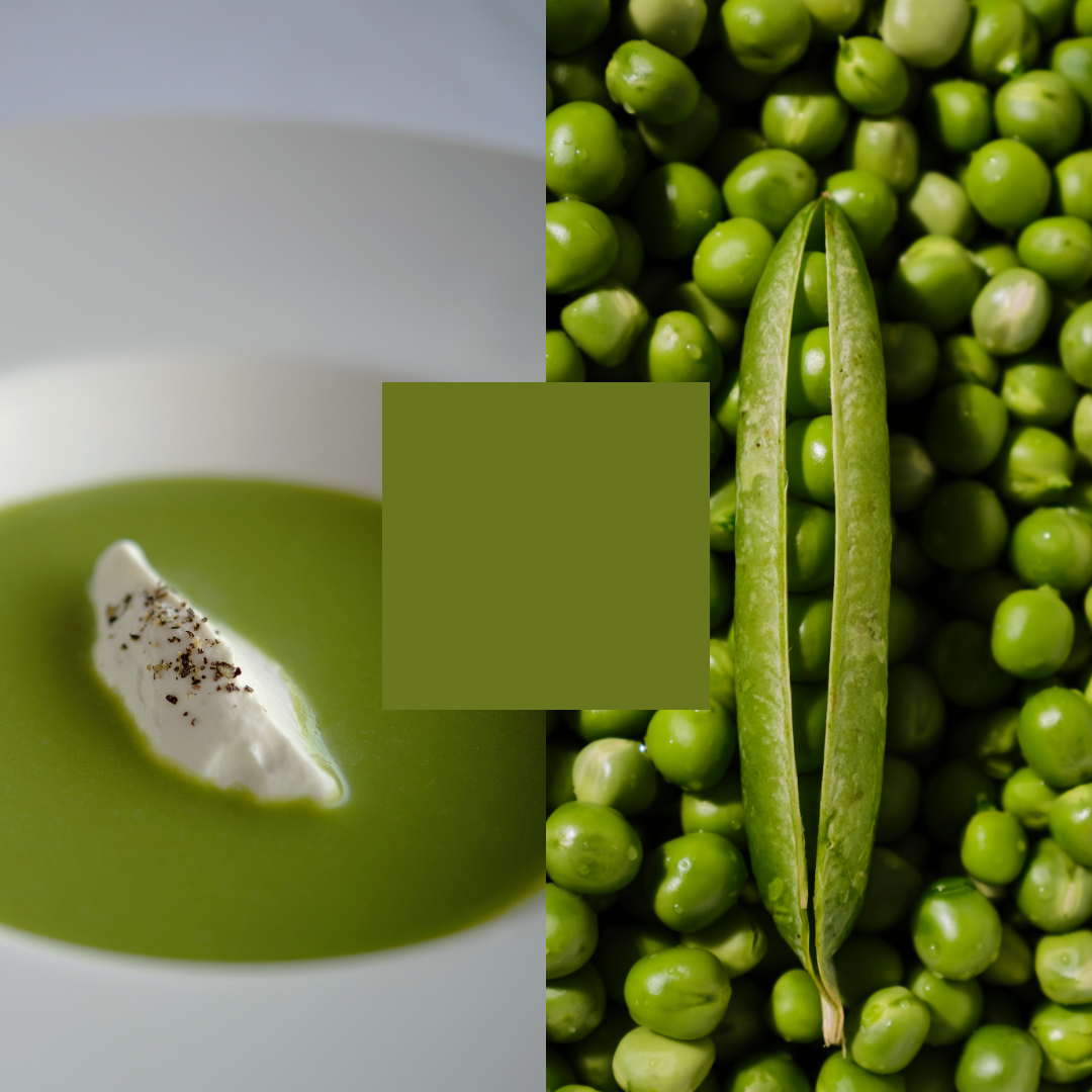
While many food companies might just want plant color as it’s easier to use, it’s worth considering the added benefit of taste to boost that ‘green is good for us’ message. While green has a bad rap from Brussels sprouts, it’s associated with a whole flavor profile. Of all the green foods we consume, only a subset are bitter. Lots of them are not, such as peas, coriander, and parsley, yet green gets labeled with bitter taste expectations.
What’s next for green food coloring?
With increased uses of green, brands should be thinking about harmonizing packaging colors and transparent windows to show the food inside. Using product design to better match expectations of food color and flavor can create more satisfying customer experiences.
Green is becoming valorized for a variety of reasons, and it’s a more appealing color in food than it has been for several decades. While some food colors look artificial, adding green is a natural color that’s almost certainly from natural sources, so there’s a health halo. People are also seeing past traditional connotations of green, such as unhappy childhood memories of bitter broccoli, to a color that is good for you and good for the planet.
Are you interest in learning more how green colors are shaping food perception and how green can work for your brand or new product development? Then contact us, we are happy to help.

