TRENDS WE ARE EXCITED ABOUT
The Power of Color
Linguistic and visual signs and symbols create and communicate spoken and unspoken meaning through a study called semiotics. Semiotics enables a brand to investigate how past, present and emerging trends are communicated to the consumer. Understanding the psychological frictions that cultivate deeper consumer motivations allows a confectioner to future-proof their company by building a framework around the underlying drivers that govern brand and product decisions.
There are four key color categories within semiotic analysis that confectioners can tap into to deeply connect with the consumer and ensure an everlasting allegiance. Unleashing the potential of each of these color worlds enables a brand to use color to signal its role and showcase that it is distinctive, savvy, visionary and culturally connected.
Color is a powerful resource in the semiotic toolbox. It boosts a brand’s ability to stand out and connect with consumer culture. Its ability to evoke moods and emotions enables a company to establish meaning in different cultures and categories. Color empowers the consumer to signal their identity, sate their curiosity, showcase their individuality, and nurture their sense of belonging. Understanding how color is interpreted through various contexts including food authenticity, functional eating, food adventures, clean eating, and conscious living governs how a brand should position itself in the color universe.
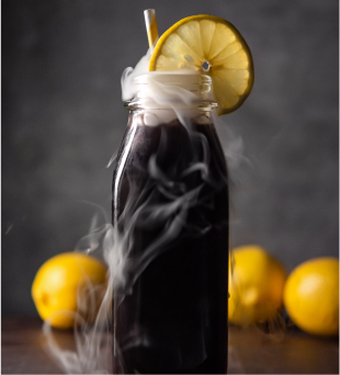
The first semiotic category is STATE CHANGE. This is the color category where consumers are searching for pleasure, power and unique experiences. Enigmatic colors that spark creative stimulation and conjure a sense of mystery align with STATE CHANGE. Bold, vivid colors with deep, dark hues and shades not normally associated with confectionery such as gray, black, cobalt and other inky shades dominate this category. The ideal color STATE CHANGE creates a sensory experience in the mouth. Smoky or sour flavor notes, stimulating printed, matte, hand-painted or glittery coatings, and rubbery, melty, fizzy and shifting textures that thrill and surprise tap into the potential of STATE CHANGE. Chocolate, lollies, hard-panned candies and gummies are ideal applications to facilitate the surreal and sometimes cosmic nature of STATE CHANGE. Partnering with a color company that has experience with the transformational requirements of STATE CHANGE ensures a brand’s success in this tricky yet exciting category.
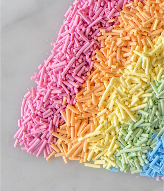
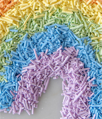
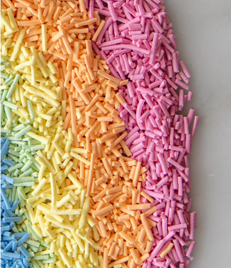
Gummies, soft-panned candies, aerated gummies and marshmallows are ideal products for the second semiotic world of JOYFUL RELEASE. This category fulfills the consumer’s desire for connection, playfulness, optimism and authenticity. Luminous rainbow shades, foamy pastels, retro neon, vibrant, shimmering fluorescence and products such as popcorn, candyfloss, frosted cupcakes, funfetti donuts and birthday cakes that evoke nostalgic food cues and a sense of solidarity and love all tap into the buzzy potential of JOYFUL RELEASE. A color company can help a brand create energized products that celebrate the vibrant inclusivity that defines this category. The glittering, electrified colors, flavors and textures that illuminate the world of JOYFUL RELEASE include layers and gradients, unicorn trends, bursting or glowing elements, and familiar flavors with a whimsical twist.
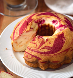
The third semiotic color world of COMFORTING & HEARTY appeals to consumers who are seeking control, nourishment and security. More traditional confections like chewy toffees, chocolate, soft-panned candies and gummies signal the mellow, familiar and transparent sensations that define the COMFORTING & HEARTY category. Brands can tap into this world’s potential by taking the consumer on an expected and assuring flavor and color journey that evokes an artisanal or heritage design with contemporary flourishes. Regional, recipe-forward flavors like mocha, floral and herbal with rich, luxurious shades like emerald, coffee and amethyst that invoke a sense of abundance, purity, honesty and seasonality are key to unleashing the potential of this category. Using natural colors with clean and clear label declarations offers consumers who are motivated by the COMFORTING & HEARTY category the modern authenticity and clarity they seek.
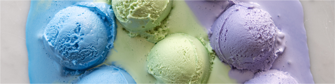
CLEAN TREATS is the fourth semiotic category driving consumer buying habits. These consumers seek out colors that signal naturalness, selfcare and indulgence with a clean and conscious twist. Applications such as tablets, aerated gummies, chewing gum and gummies are ideally suited for the CLEAN TREAT world where dominant color cues include muted, milky shades of purples, reds, pinks and blues. Colors comprise a clean, aspirational mosaic defined by softness, earthy and wet-look pastels, edgeless color that is glossy and tactile, radiant, jewel-toned shades that are layered and clearly defined, and minimalist, better-for-you hues such as ombre, light pink, turquoise and lilac. The CLEAN TREAT world embraces Instagrammable color combinations that arouse sensations of playful health, vitality and radiancy. Using plant-focused colors for applications designed to capitalize on this semiotic world is an easy way to tap into the potential of the CLEAN TREAT category.
Semiotics empowers a brand to tap into the deep psychological motivations driving consumer buying decisions. Harnessing the power of color within these four semiotic color worlds insulates confectioners from market volatility by establishing deep, trusting and lasting relationships with consumers. GNT’s plant-focused colors with their clean and clear labels is an easy way for a brand to signal to the consumer that they understand and are fulfilling their desire to express their individuality, foster a sense of belonging, play joyfully and live vibrantly.
Get in touch with your local GNT sales representatives today if you would like to learn more about how semiotic ‘color worlds’ can boost your brand innovation strategy